
Home Ground Kingston
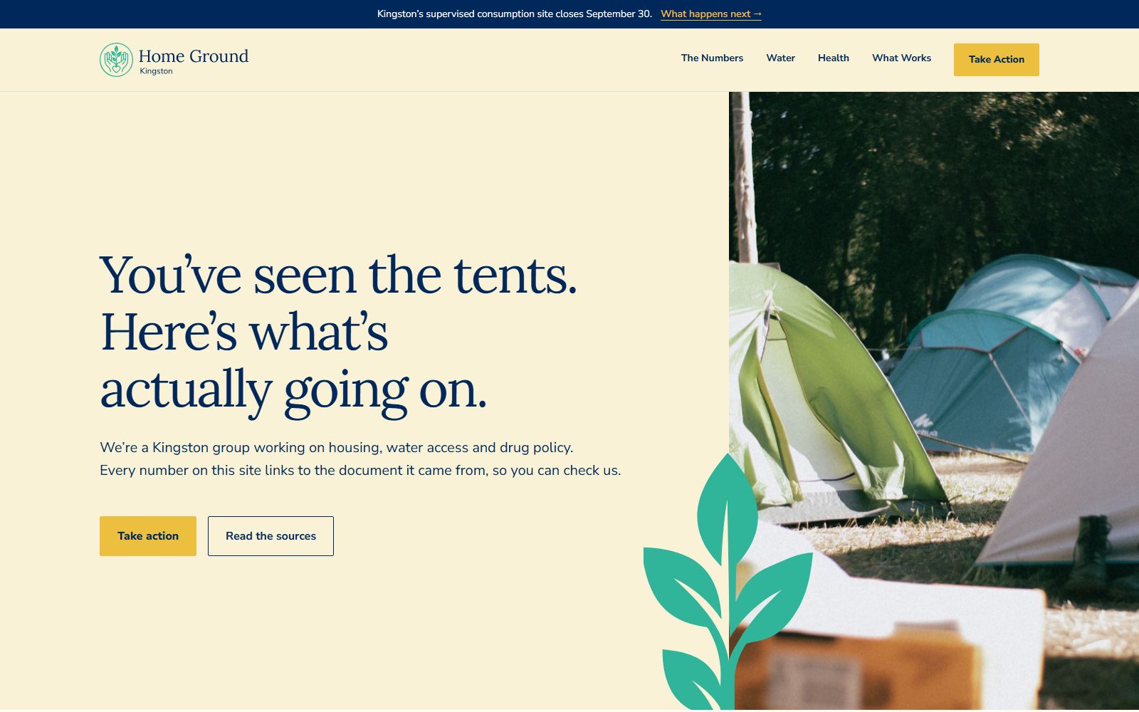
How this one came about
Home Ground works on housing, water access and drug policy in Kingston. They arrived with a clear mission and a strong case, and we did the rest: the research, the copywriting, the brand and the build. What the mission needed was a site that could be checked by someone who disagrees with it and still hold up, and that a person would actually want to read on the way there.
The writing itself follows conversion copywriting principles, moving a reader from a headline to the evidence to an action, and the SEO was done properly from day one, so someone searching for the facts on housing in Kingston finds this site and its sources.
It went live in August 2026 at homegroundkingston.ca.
A brand from the ground up
Home Ground arrived with no visual identity at all, so we built the brand before we built a single page. The mark is a hand-drawn leaf beside the name set in navy: the leaf for growth and for the literal ground in their name, the navy for the seriousness their subject deserves. The palette, the type and the rules for combining them all grew out from that mark, and the website is that brand applied to the screen.
The design system we built for them.
Every colour, typeface and shape is one value in one file, with the reason for it written beside it. Here are the parts worth showing.
Logo

A hand-drawn leaf and a navy wordmark. The leaf is the optimistic half: growth, roots, home ground. The navy is the credible half, the colour of a document that expects to be checked.
Colour
Navy
#00285A
The colour a serious document wears. It carries every word of body text, so the whole site reads with the weight of a briefing.
Teal
#30B59B
From the leaf. Water and renewal, for a group with water access in its mandate.
Purple
#635495
The closing note on every page, quieter than the argument that came before it.
Mint
#AFD3CC
Calm ground for hard numbers. When the page shifts from argument to figures, the surface softens with it.
Gold
#EDBF3E
The highlighter. Gold marks the gap in the data and the moments that ask something of you. Reserving one colour for that job means it never has to shout.
Sky
#6295B7
Openness. The counterweight to all that navy.
Cream
#F9F2D7
The colour of paper, for a site that behaves like a document.
Type
Lora
Lora, Georgia, Cambria, serifYou’ve seen the tents.
Headlines and pull figures. A serif was the right call for a site whose whole argument is that it did the reading: it looks like a document, because it’s behaving like one.
Nunito Sans
Nunito Sans, system-ui, sans-serifEvery figure links to the document it came from
Body copy, labels and every number in a chart. Rounder and plainer than the headline face, so a long evidence page stays comfortable to read all the way down.
The decisions
- The colour is worn saturated and small
- Cream and white carry the page, and the brand colours arrive in small, full-strength hits. A little saturated colour is louder than pastel everywhere, and it keeps the attention on the argument.
- Ground changes mean a change of subject
- Cream opens the page, mint sits under the evidence, paper carries everything else. A reader learns the rhythm without being told: when the ground changes, the subject just changed.
- Accessible by rule, on every deploy
- The palette was chosen and checked so the site is fully WCAG 2.1 AA compliant, and the build refuses to deploy any change that would break that. For a group whose case involves disability income, the site being readable by everyone is part of the argument.
Public data, drawn to be read
The figures existed before this site did, scattered through reports and appendices that nobody reads. We did the reading, then chose to draw the numbers, because a statistic you read slides past and one you can see lands. Drawing the data lets a visitor feel the size of the problem in a way a printed number never manages, and it keeps them moving through an argument that would stall as a table.
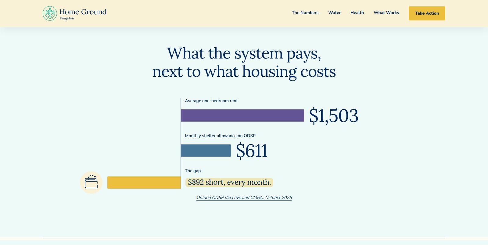
Every figure on the site also links to the document it came from, so a skeptical reader can check the sources themselves.
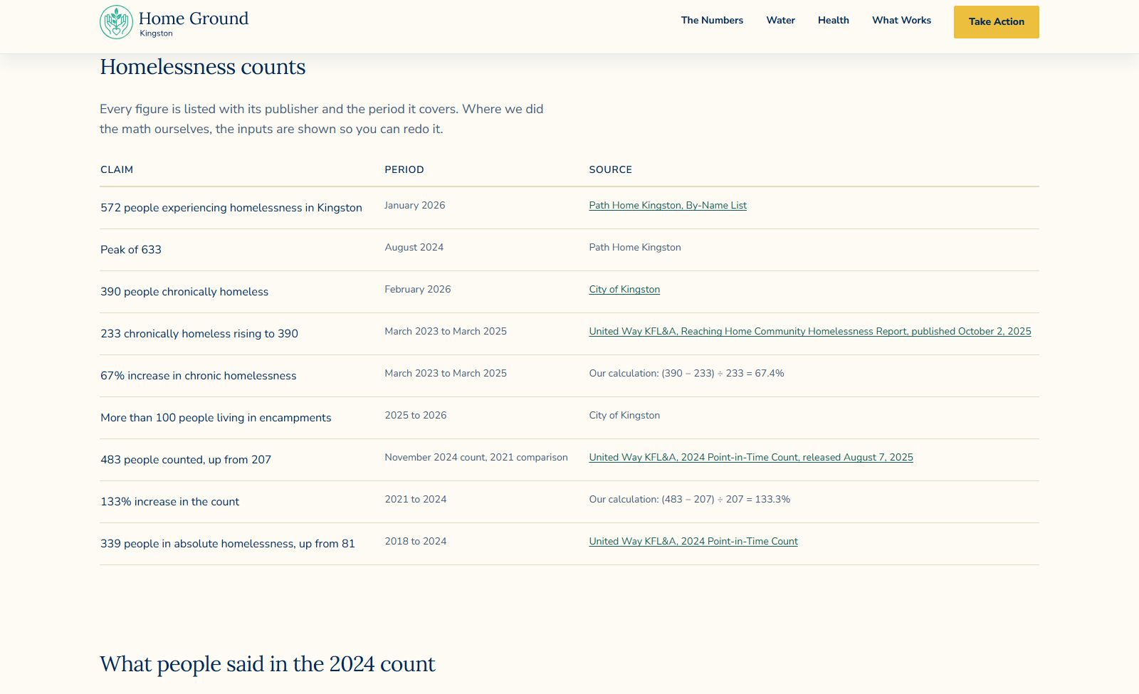

Go and check it.
The site is live at homegroundkingston.ca. Pick any number on it and follow the link.
Looking to build something cool?
Set up a free 20-minute call with us and tell us about your project.