
Feed the People Kingston
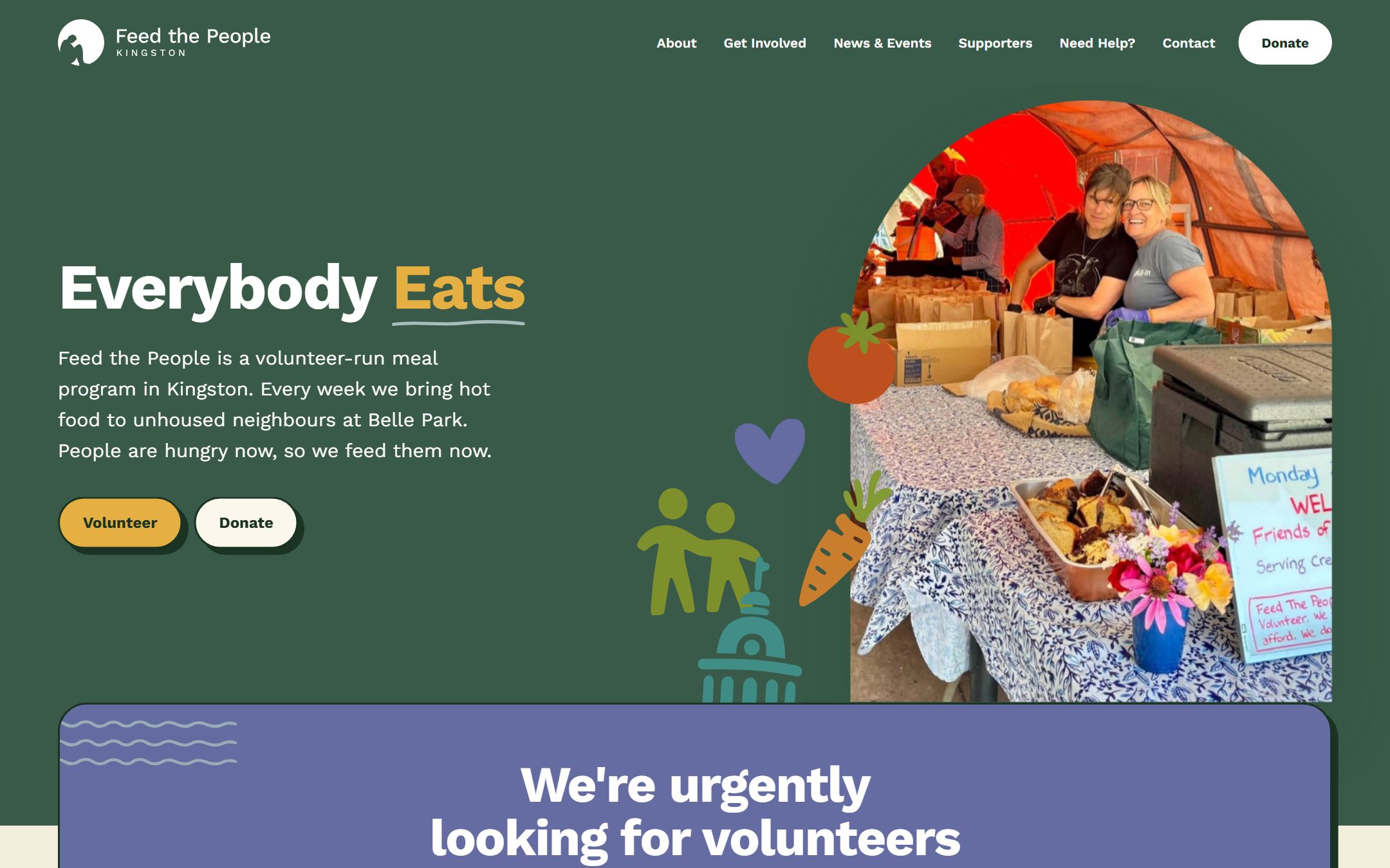
Feed the People serves hot lunch at Belle Park every day, run entirely by volunteers. Holly is one of them, which is how this project started. Before this site, everything lived on social media: the schedule, the volunteer calls, the donation link. If you were hungry and didn’t already follow them, there was nothing to find.
So the site had to work for two very different people. Someone looking for a meal today, often on an old phone with a weak connection. And someone with time or money to give, who wants to know an organization is real before handing over either. It’s live now at feedthepeoplekingston.com.
A page that answers the actual question
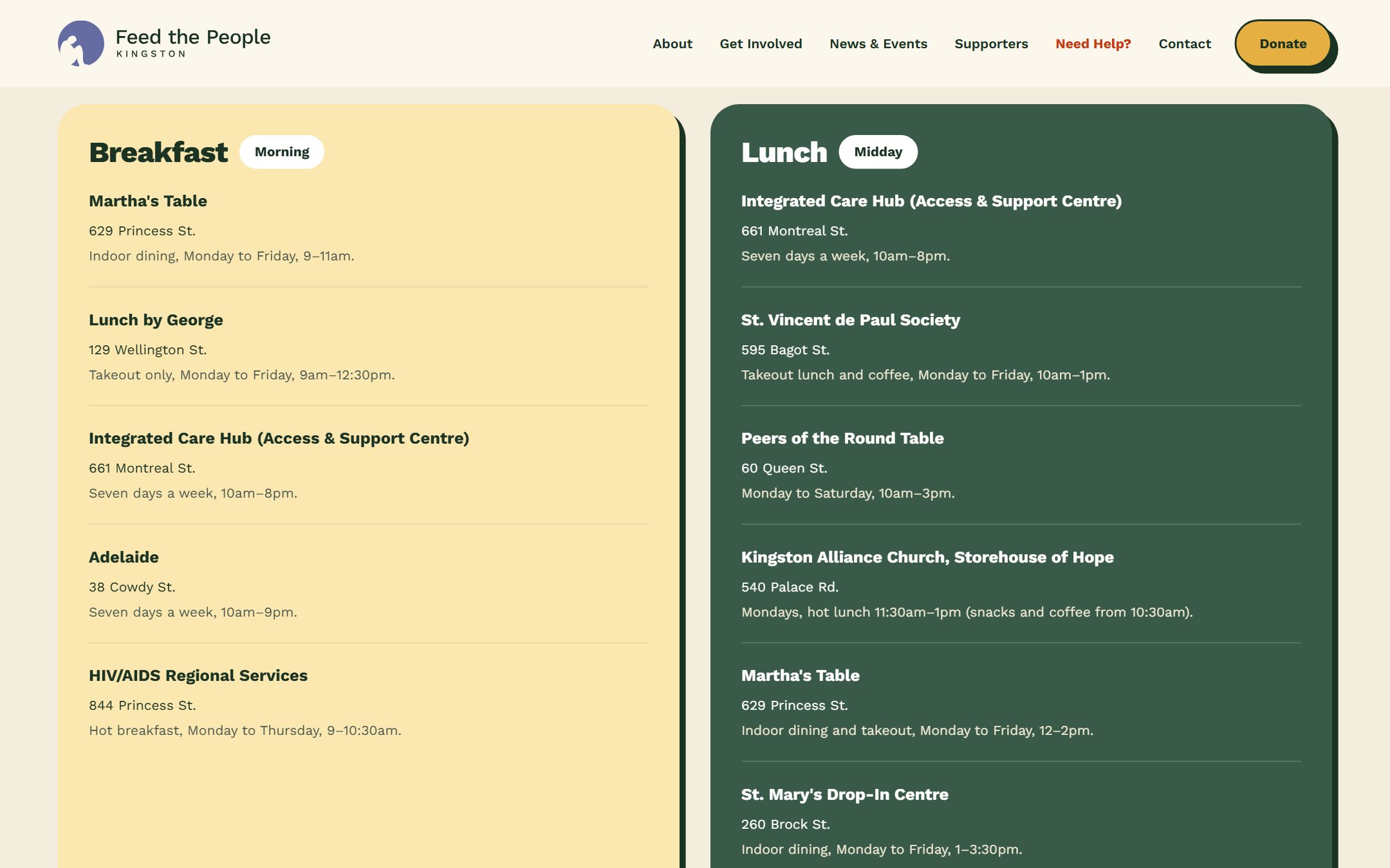
The Need Help page lists every free meal in Kingston, sorted the way a hungry person thinks about it: breakfast, lunch, dinner, food banks. Their own service is on it, and so are Martha’s Table, the Integrated Care Hub, St. Vincent de Paul, the pantries and the crisis lines. Addresses, hours and phone numbers, on one page that loads fast and reads clearly on a phone.
The brand came first
Before a single page was designed, we did the brand work. Feed the People had a logo the community already knew, so we kept it and refreshed it, then built a full identity out from the mark: the palette, the type, the hand-drawn food motifs and the rules for how they combine. The site came after, assembled from that system, which is why every page feels like it belongs to the same organization.
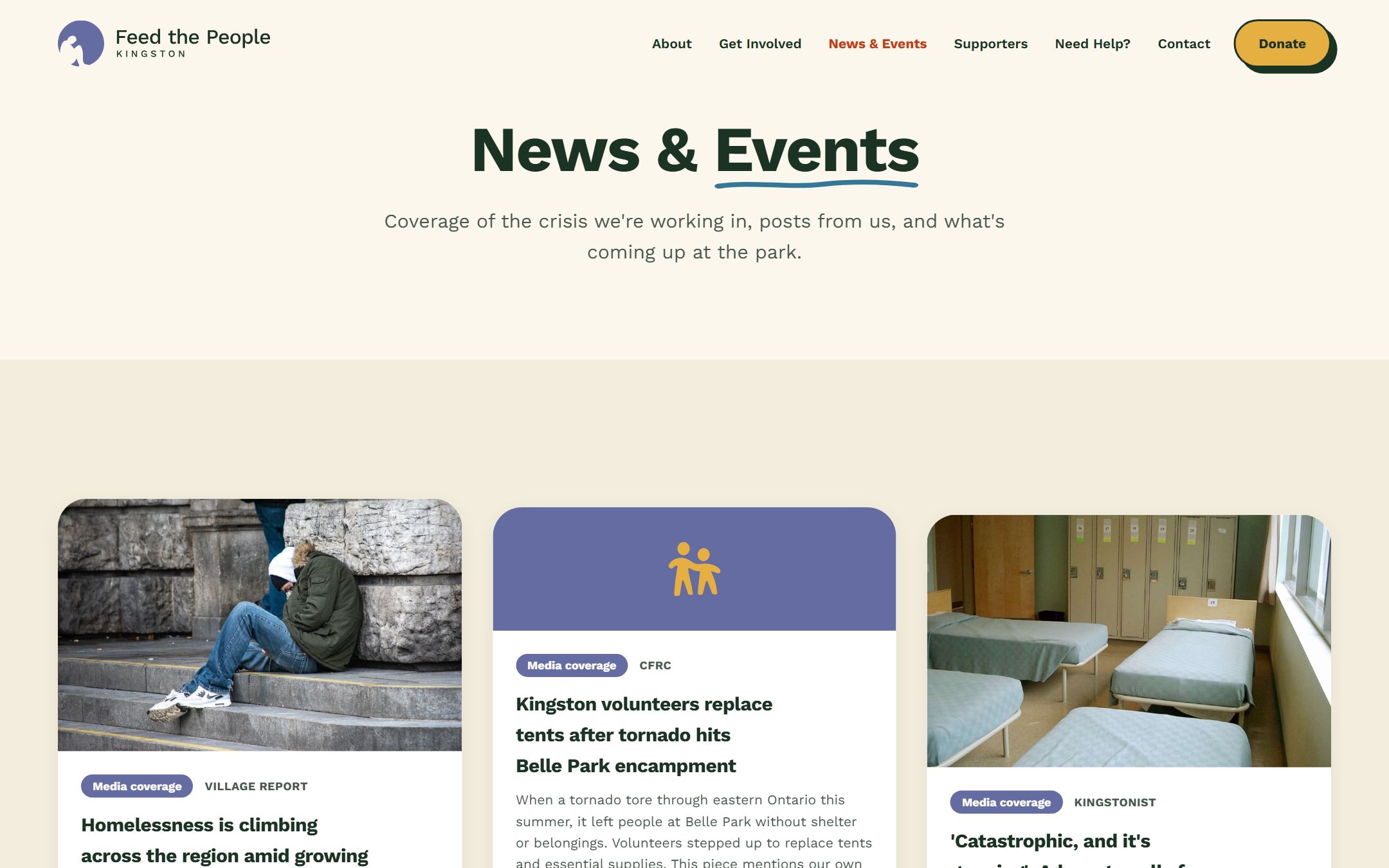
That’s also what makes the site safe to grow. New pages get built from the same named parts, so next month’s event or news item comes out on brand without anyone policing it.
Written to be found
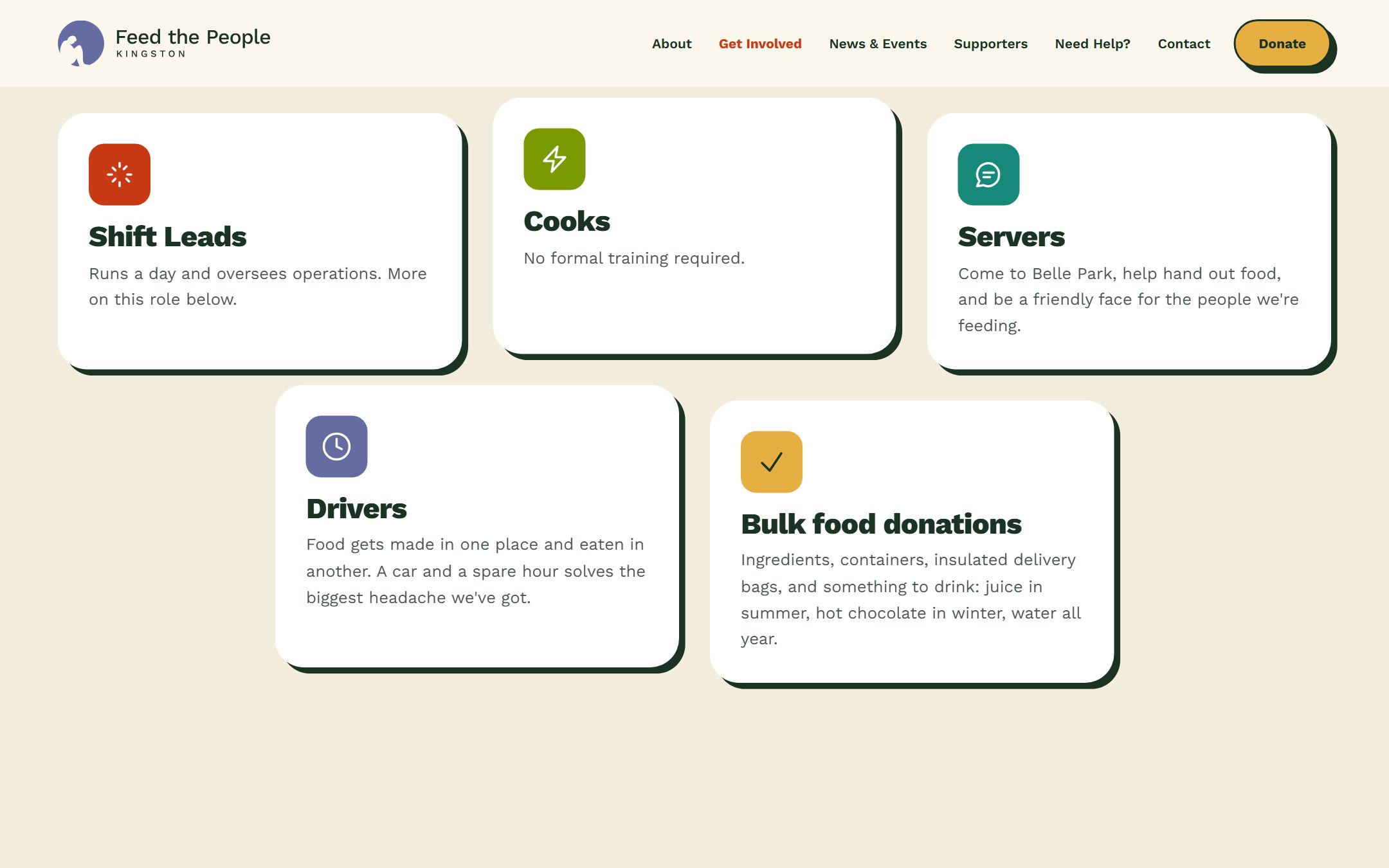
We wrote the site’s copy with conversion copywriting principles and SEO from the start. Someone searching for a free meal in Kingston finds this site, and the page they land on answers the question before it explains anything. Someone searching for the organization finds the proof they need to volunteer or donate. Every page says the useful thing first, and every page is structured so a search engine can make sense of it.
The design system we built for them.
Every colour, typeface and shape on the site is one value in one file, written down with the reason for it. Here are the parts worth showing.
Logo

A refresh, on purpose. The hand-drawn mark stayed, because the people it serves already recognized it. We redrew it to hold up at every size, set it in a green-black that matches the body text and gave it a permanent home on cream, so the mark and the page always agree.
Colour
Terra
#C83A14
The colour of a hot meal: tomato soup, baked crust, warmth. It carries every button and link, so the thing that asks you to act is also the thing that says you’ll be fed.
Forest
#395A48
Belle Park’s trees, holding up the hero like the tent they actually serve under. It grounds the warm colours so the site feels sheltered.
Lake
#357797
The calm one. It closes each page the way a conversation winds down, steady and unhurried.
Gold
#E6AF41
Harvest and plenty. It lights the hand-drawn food illustrations and the moments worth celebrating.
Periwinkle
#646CA2
The friendly surprise, pulled from the original drawing. It keeps the palette from feeling institutional.
Cream
#FBF7EC
The base of every page. Warm like a kitchen.
Ink
#1A3323
The text colour is a green-black, so even the words feel organic.
Type
Work Sans
Work Sans, system-ui, sans-serifEverybody Eats
One typeface for the whole site, in a few weights. A single voice keeps the pages feeling like one organization, and a plain, open face leaves room for the hand-drawn motifs to be the personality.
The decisions
- The arch
- The photos live in an arched frame because the arch is the shape of the serving tent and of an open doorway: shelter and welcome, the two things the organization actually offers.
- The sticker shadow
- Buttons and cards look cut out by hand and stuck down, like a community poster. That’s the energy of the organization itself: made by people, up on a wall, inviting you in.
- Accessible by rule, on every deploy
- The colours were chosen and checked so the site is fully WCAG 2.1 AA compliant, and the build refuses to deploy any change that would break that. Someone finding their next meal on a five-year-old phone in bright sunlight is the core user here, so this was never optional polish.

Go and look at it.
The site is live and open to everyone at feedthepeoplekingston.com.
Theirs to keep
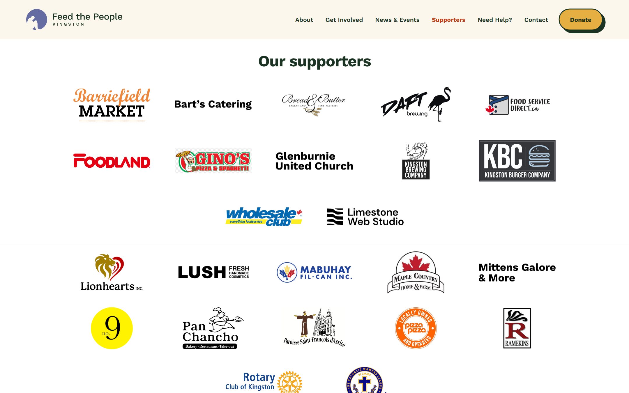
Everything on the site can be edited in a browser, no code involved: hours, news, events, the wall of local businesses that back them. And all of it belongs to Feed the People outright, from the domain to the repository.
Looking to build something cool?
Set up a free 20-minute call with us and tell us about your project.