
“I’ll know it when I see it” finally works as a brief
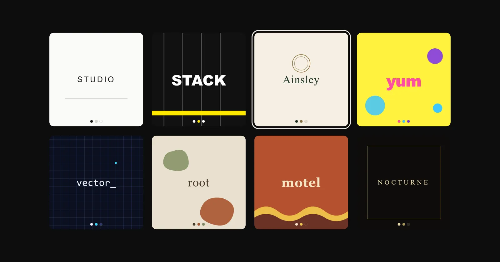
There’s a point in every branding conversation where we ask what you want the site to look like, and the room goes quiet. Somebody offers “clean?” or “modern, but warm.” Eventually somebody says the honest one: “I’ll know it when I see it.”
That answer makes sense. Most of us aren’t designers, so we don’t have the vocabulary for why something works. The feeling is real even when the words are missing.
So we built a thing that skips the vocabulary problem entirely. It’s called the Brand Compass, and it takes about ninety seconds: we show you two design tiles, you pick whichever feels more like you, and we do that a few times.
Okay, but what’s actually happening?
Behind it is a real model, and no scoring table. (You know the personality-quiz kind: answer B three times and congratulations, you’re a dolphin.)
Under the hood is a vision model, the same kind of AI that can look at a photo and tell you what’s in it. The useful bit is how these models organize what they see: everything lands on a big map where similar-feeling things sit near each other. A letterpress wedding invitation and an old bookshop sign end up in the same neighbourhood. A neon gym logo ends up across town.
Every tile in the quiz has a known spot on that map, so about a dozen picks are enough to place you on it. The closest of sixteen named brand directions becomes yours. Holly and I wrote those directions ourselves, with real palettes, type choices and reference brands attached. The machine only does the matching.
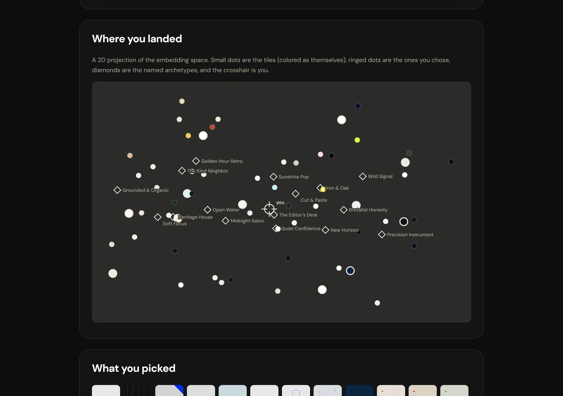
At the end you get a direction with a name on it. Maybe you’re Quiet Confidence. Maybe you’re Brutalist Honesty (rude, but fair). You also get the map above with your actual dot on it, so you can see for yourself what you landed near.
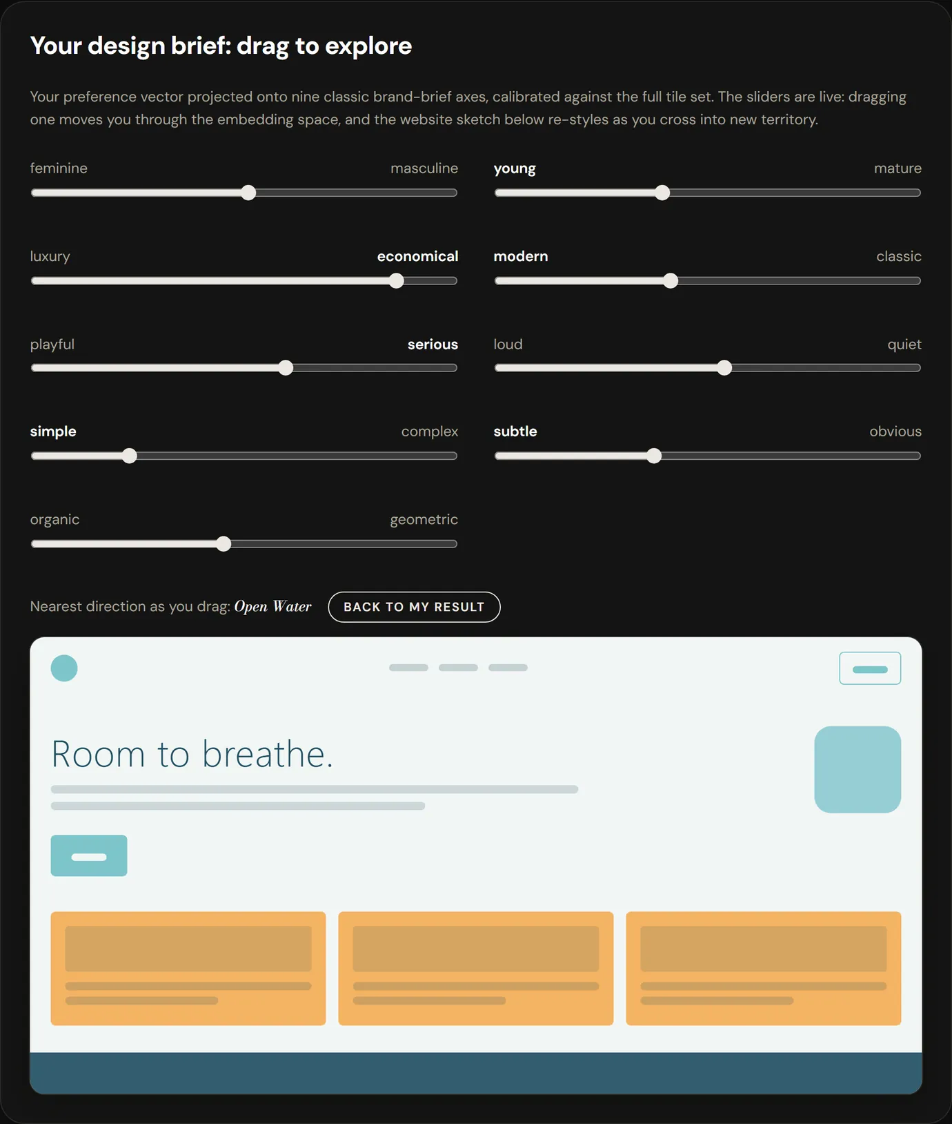
My favourite part is the little website sketch at the bottom. It restyles itself live to match your result, and it comes with nine sliders: feminine to masculine, playful to serious and seven more. Drag one and the sketch redesigns itself in front of you. It’s weirdly fun, and it’s the fastest way I’ve found to work out what “more like this” actually means.
The fine print
First: the whole thing runs in your browser. Your picks don’t get sent anywhere. The shareable result link is just a note about which tiles you clicked.
Second: it’s a prototype, and taste is fuzzy. Take it twice and you might get a slightly different answer. When your picks genuinely split two ways, it tells you you’re a blend and shows you both directions. I like that it admits this.
Why we bothered
This is how our projects start. Before anyone touches a homepage, we have to find the direction that feels like you. The quiz is basically that first hour, compressed to a map. Show up to a call with your result and we’re already halfway into the conversation.
Also, I built it because it was fun. Kingston deserves at least one web studio that plays with its tools in public.
Go find your direction. Send us what you get, especially if you come out a blend, because those are the fun ones.
Goldwin

Find your direction in about ninety seconds
About a dozen quick picks, and your choices never leave your browser.